Developing a Custom chart
Introduction
Custom Charts enable you to develop your own specialized data visualizations and connect them to Luzmo , allowing you and your users to easily add them to Luzmo dashboards. If our built-in chart types don't fully cover your specific visualization needs, you can create custom charts tailored exactly to your requirements.
Why use Custom Charts?
Complete visualization flexibility: Design exactly the chart types your data or use case needs, ensuring your end-users get precisely the visualization experience required.
Efficient implementation: Write only your visualization code and let Luzmo do the rest — querying, filtering and interactivity is all handled for you. Maintain complete control over your visualization UI/UX while leveraging Luzmo's powerful analytics infrastructure.
Full integration with Luzmo's capabilities : Your custom charts seamlessly integrate into Luzmo dashboards.
We provide a Custom Chart Builder that provides a complete development environment for building, testing, and packaging custom chart components.
Key features of the custom chart builder environment:
Interactive development environment with live preview
Configurable data slots for chart customization
Automatic build and refresh on code changes
Schema validation for chart configuration
Production-ready packaging tools
Quick start
Prerequisites
Node.js v22.13 or newer. The repository includes an
.nvmrcfile you can use withnvm use.npm
Installation
Clone the custom chart builder repository from our GitHub:
bashgit clone https://github.com/luzmo-official/custom-chart-builder.git cd custom-chart-builderInstall dependencies:
bashnpm installStart the custom chart builder development environment:
bashnpm run start
The development environment will be available at http://localhost .
This command starts three processes:
The Angular builder UI
A local bundle server that serves your custom chart files
A watcher that rebuilds your chart when files in
projects/custom-chart/srcchange
Once it's up and running, log in to the environment with your Luzmo account. This will bring you to the builder environment. The page features 3 areas:
Dataset selection : open the dropdown to select one of your datasets to show its columns.
Chart slots : this area shows a visual representation of the chart slots you defined in your
manifest.json. Changes to the manifest will be reflected in this area. Columns can be dragged to these chart slots. Once all required slots are filled, a Luzmo query will execute and show you the returned data. This gives you useful information about the shape of the data you'll be working with in your visualization code.Chart visualization : this area executes the
rendermethod of your chart code with the data returned by the query. It shows you how your custom chart will look in your dashboards, based on your current code.
Project structure
custom-chart-builder/
├── custom-chart-build-output/  # Production build files
├── projects/
│   ├── builder/                # Angular application for the chart builder UI
│   └── custom-chart/           # Your custom chart implementation
│       └── src/
│           ├── chart.ts        # Main chart rendering logic
│           ├── chart.css       # Chart styles
│           ├── manifest.json   # Chart configuration and slot definitions
│           ├── icon.svg        # Chart icon
│           └── index.ts        # Entry point
Your main working directory will be the projects/custom-chart/src directory, where your custom chart implementation is located. Do NOT update projects/builder .
Creating your custom chart
Let's dive into the process of implementing your own custom chart.
Key files to modify
To create your own chart, you'll primarily need to edit these three files:
manifest.json - define your chart's data slots and configuration.
chart.ts - this is where you'll implement the chart rendering logic.
chart.css - add styles for your chart's visual appearance.
The index.ts file is the entry point for the bundled chart module. In most cases you only need to keep it exporting the public chart functions from chart.ts :
export { render, resize, buildQuery } from './chart'; If you do not implement buildQuery , remove it from this export as well.
Manifest configuration
The manifest.json file defines the data slots of your custom chart. A data slot can receive one or multiple columns from your datasets. These slot definitions determine what type of columns are accepted by your chart and how these options are displayed in Luzmo's editor. Based on the slot definitions, Luzmo will automatically generate and update queries to retrieve data in the format expected by your chart once all required slots are filled.
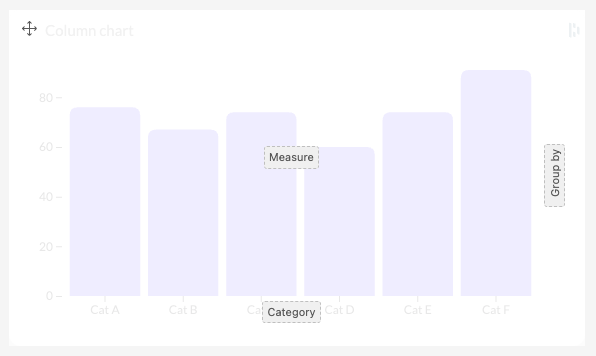
For example, Luzmo's built-in column chart has 3 slots: "Measure", "Category", and "Group by". As set in the slot definitions, the "Measure" slot will accept multiple columns, while the "Category" column will only accept one column. When the "Measure" slot contains more than 1 column, the "Group by" slot must be empty, and vice-versa.
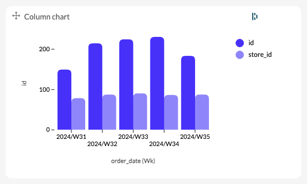
When a user adds columns to the chart, Luzmo will automatically retrieve the aggregated data, respecting any applied filters. In the example below, Luzmo will query the unique id's and unique store_id's, aggregated by week, from a dataset containing ecommerce orders. When developing the chart, that's the data you'll have to visualize.
Required data slot properties
| Parameter | Type | Description |
|---|---|---|
name | string | Internal identifier for the slot. Note : within one chart, all slots must have unique names! Use for example 'x-axis' , 'y-axis' , 'category' , 'measure' , 'legend' , ... |
Optional data slot properties
| Parameter | Type | Description |
|---|---|---|
acceptableColumnSubtypes | array | Restricts the slot to specific column subtypes. Supported values are 'duration' , 'currency' , 'coordinates' , and 'topography' . Mostly used with spatial slots, for example to accept only 'topography' on a choropleth map. |
acceptableDataFieldTypes | array | Data field types this slot accepts. Allowed values are 'numeric' , 'hierarchy' , 'datetime' , and 'spatial' . |
canAcceptFormula | boolean | Whether the slot accepts Formula-type data fields in addition to regular columns. |
canAcceptMultipleDataFields | boolean | Whether the slot accepts more than one data field at the same time. |
description | string | Short explanation of the slot's purpose. |
isHidden | boolean | When true , the slot is not shown in the dashboard editor UI. |
isRequired | boolean | When true , the chart will not query data until this slot has been filled. |
label | string | User-facing name shown in the dashboard editor, e.g. 'Category', 'Value', 'Legend', ... |
noMultipleIfSlotsFilled | array | Names of other slots that, when filled, prevent this slot from accepting multiple data fields. For example, on a bar chart the measure slot uses ["legend"] so adding a legend forces a single measure. |
options | object | Per-slot behavior toggles such as aggregation, binning, and grand totals. See the "Slot options properties" table below. |
position | string | Where the slot button appears within the chart in the dashboard editor. One of 'top-left' , 'top' , 'top-right' , 'right' , 'bottom-right' , 'bottom' , 'bottom-left' , 'left' , or 'middle' . |
requiredMinimumColumnsCount | number | Minimum number of data fields that must be added to the slot before the chart will query data. |
rotate | boolean | When true , the slot button in the editor is rendered rotated 90°. Typically used for vertical axis slots. |
type | string | Data role used to auto-generate the query. One of 'categorical' or 'numeric' . Categorical slot content is added to query.dimensions , numeric slot content to query.measures . |
When you rely on the automatically generated query, the slot type is the most important contract between your manifest and your chart code. Luzmo adds content from categorical slots to query.dimensions , content from numeric slots to query.measures , then returns each data row in the same order: dimensions first, then measures.
Slot options properties
| Parameter | Type | Description |
|---|---|---|
areDatetimeOptionsEnabled | boolean | When true , exposes date/time formatting options (week start, week-day name format, month name format) for datetime columns added to the slot. |
isAggregationDisabled | boolean | When true , hides the aggregation function picker for numeric columns added to the slot. |
isBinningDisabled | boolean | When true , hides the binning controls for numeric columns added to the slot. Binning groups continuous numeric values into ranges so they can be used as a category. |
isCumulativeSumEnabled | boolean | When true , lets users apply a cumulative-sum aggregation to numeric columns in this slot. |
showOnlyFirstSlotContentOptions | boolean | When false , hides the per-column options panel for the second and subsequent data fields in the slot. Useful for select-box-style slots where every entry should share the same options. |
Example Manifest
Here's a complete example of a manifest.json file for a basic column chart:
{
  "slots": [
    {
      "name": "category",
      "rotate": false,
      "label": "Category",
      "type": "categorical",
      "order": 1,
      "options": {
        "isBinningDisabled": true,
        "areDatetimeOptionsEnabled": true
      },
      "isRequired": true,
      "position": "bottom"
    },
    {
      "name": "measure",
      "rotate": true,
      "label": "Value",
      "type": "numeric",
      "order": 2,
      "options": {
        "isAggregationDisabled": false
      },
      "isRequired": true,
      "position": "middle"
    },
    {
      "name": "legend",
      "rotate": false,
      "label": "Legend",
      "type": "categorical",
      "order": 3,
      "options": {
        "isBinningDisabled": true
      },
      "isRequired": false,
      "position": "right"
    }
  ]
}
During the build process, this manifest is automatically validated against the Zod schema. You can also run:
npm run validate to check the validity of your manifest.json against the Zod schema without performing a full build.
Chart implementation
Core functions
To create a working Luzmo custom chart, you'll need to implement at least the render and resize functions.
You can also implement the buildQuery function to create a custom data query if your chart requires it. If your chart does not require a custom data query, you can omit this function entirely and a Luzmo query will be automatically generated based on your slot configurations.
You can find these methods in the chart.ts file, located in the projects/custom-chart/src directory.
Data shape
The data property passed to render contains the rows returned by the Luzmo query. Each row is an array, and the array order follows the query output order: dimensions first, then measures.
For the example manifest above, where category and legend are categorical slots and measure is numeric, a row can look like this:
[
  { id: 'belgium', name: { en: 'Belgium' }, color: '#4f46e5' }, // category dimension
  { id: 'enterprise', name: { en: 'Enterprise' } },             // legend dimension
  12450                                                        // measure
]
Common value shapes are:
Numeric measures:
numberDatetime dimensions: ISO8601 datetime strings
Hierarchy dimensions: an object with optional
idandnamefields and optionalcolorfieldSpatial values: objects such as coordinates or topography data, depending on the selected column subtype
Your chart should handle incomplete input gracefully. While users are configuring a dashboard, required slots can be empty and data can be an empty array. In those cases, render a lightweight empty state or placeholder instead of assuming every row and slot exists.
render function
The render function is the main function that will be called by Luzmo to initially create and render your chart. It will receive a ChartParams object as a parameter, which contains the following properties:
// Import required types
import type { ItemData, Slot, SlotConfig, ThemeConfig } from '@luzmo/dashboard-contents-types';
import * as d3 from 'd3';

interface ChartParams {
  container: HTMLElement;           // The DOM element where your chart will be rendered
  data: ItemData['data'];           // The data rows from the server
  slots: Slot[];                    // The filled slots with column mappings
  slotConfigurations: SlotConfig[]; // The configuration of available slots
  options: Record<string, any> & { theme?: ThemeConfig }; // Additional options passed to the chart
  language: string;                 // Current language code (e.g., 'en')
  dimensions: {                     // Width and height of the chart container in pixels
    width: number;
    height: number;
  };
}

// Render function implementation
export function render({
  container,
  data = [],
  slots = [],
  slotConfigurations = [],
  options = {},
  language = 'en',
  dimensions: { width = 600, height = 400 } = {}
}: ChartParams): void {
  // 1. Clear the container
  container.innerHTML = '';

  // 2. Check if data exists
  const rows = data ?? [];
  const hasData = rows.length > 0;

  if (!hasData) {
    container.textContent = 'Add data to preview this chart.';
    return;
  }

  // 3. Extract and process data
  const chartData = rows.map(row => {
    const rawCategory = row[0];
    let categoryValue: unknown = rawCategory ?? 'Unknown';

    if (typeof rawCategory === 'object' && rawCategory !== null && 'name' in rawCategory) {
      const categoryObject = rawCategory as { name?: string | Record<string, string>; id?: string };
      categoryValue =
        typeof categoryObject.name === 'object' && categoryObject.name !== null
          ? categoryObject.name[language] ?? categoryObject.name.en ?? Object.values(categoryObject.name)[0]
          : categoryObject.name ?? categoryObject.id ?? 'Unknown';
    }

    return {
      category: String(categoryValue),
      value: Number(row[1] ?? 0)
    };
  });

  // 4. Create visualization (SVG, Canvas, etc.)
  const svg = d3.select(container)
    .append('svg')
    .attr('width', width)
    .attr('height', height);

  // 5. Add your chart elements here...

  // 6. Store state for resize
  (container as any).__chartData = chartData;
}
resize function
The resize function is called when the chart is resized. It will receive a ChartParams object as a parameter, which contains the following properties. The dimensions property will contain the new width and height of the chart, which you can use to update the sizes of the elements in your chart.
A common pattern is to store processed chart data on the container during render , then read it back in resize so resizing does not require reprocessing the original rows. Reuse the DOM elements created by render when possible, and update their dimensions.
export function resize({
  container,
  slots = [],
  slotConfigurations = [],
  options = {},
  language = 'en',
  dimensions: { width = 600, height = 400 } = {}
}: ChartParams): void {
  const chartData = (container as any).__chartData ?? [];

  const svg = d3.select(container)
    .select<SVGSVGElement>('svg')
    .attr('width', width)
    .attr('height', height);

  // Update scales, axes, and marks using chartData and the new dimensions.
  // If your chart is simpler, you can also call a shared updateChart(svg, chartData, dimensions) helper.
}
buildQuery function (optional)
The buildQuery function takes the slot configurations and filled slots and uses them to create a Luzmo data query that fetches the appropriate data.
IMPORTANT: The
buildQuery()method is completely optional. If you don't implement this method, Luzmo will automatically generate and run the appropriate query for your chart based on the slots configuration. You only need to implement this method if you want to customize the query behavior.
For a full reference of the available query parameters, see the Luzmo Query Syntax Documentation .
Example implementation:
import type {
  ItemQuery,
  ItemQueryDimension,
  ItemQueryMeasure,
  Slot,
  SlotConfig
} from '@luzmo/dashboard-contents-types';

interface BuildQueryParams {
  slots: Slot[];
  slotConfigurations: SlotConfig[];
}

export function buildQuery({
  slots = [],
  slotConfigurations = []
}: BuildQueryParams): ItemQuery {
  const dimensions: ItemQueryDimension[] = [];
  const measures: ItemQueryMeasure[] = [];

  // Extract category dimension
  const categorySlot = slots.find(slot => slot.name === 'category');
  const categoryContent = categorySlot?.content;

  if (categoryContent?.length > 0) {
    const [category] = categoryContent;
    dimensions.push({
      dataset_id: category.datasetId,
      column_id: category.columnId,
      level: category.level || 1
    });
  }

  // Extract measure
  const measureSlot = slots.find(slot => slot.name === 'measure');
  const measureContent = measureSlot?.content;

  if (measureContent?.length > 0) {
    const [measure] = measureContent;

    // Handle different types of measures
    if (measure.aggregationFunc && ['sum', 'average', 'min', 'max', 'count'].includes(measure.aggregationFunc)) {
      measures.push({
        dataset_id: measure.datasetId,
        column_id: measure.columnId,
        aggregation: { type: measure.aggregationFunc }
      });
    }
    else {
      measures.push({
        dataset_id: measure.datasetId,
        column_id: measure.columnId
      });
    }
  }

  // Add ordering by category, if category slot is filled.
  const order: ItemQuery['order'] = categoryContent?.[0]
    ? [{
        dataset_id: categoryContent[0].datasetId,
        column_id: categoryContent[0].columnId,
        order: 'asc'
      }]
    : [];

  // Add default limit of 10000 rows for performance reasons.
  const limit = { by: 10000, offset: 0 };

  const query: ItemQuery = {
    dimensions,
    measures,
    order,
    limit
  };

  return query;
}
When Luzmo calls your buildQuery function, returning the ItemQuery object is enough. You do not need to send a separate queryLoaded event for the initial query. Use queryLoaded only when the chart changes its query at runtime, for example after a user sorts a custom table or moves to another page.
Data formatting
Luzmo provides a powerful formatter utility that helps format your data based on the format configured for the column (which can be changed by the user in the dashboard editor). You can import this utility from @luzmo/analytics-components-kit/utils :
import { formatter } from '@luzmo/analytics-components-kit/utils';It takes a slot content (i.e. a column) as an argument and returns a function that formats the data based on the format configured for the column.
The formatter function automatically handles:
Number formatting (thousands separators, decimal places)
Date/time formatting
Currency formatting
Percentage formatting
Example usage in your chart:
import { formatter } from '@luzmo/analytics-components-kit/utils';

export function render({ data, slots }: ChartParams): void {
  const rows = data ?? [];
  const categorySlot = slots.find(slot => slot.name === 'category');
  const measureSlot = slots.find(slot => slot.name === 'measure');
  const categoryContent = categorySlot?.content?.[0];
  const measureContent = measureSlot?.content?.[0];

  const measureFormatter = measureContent
    ? formatter(measureContent)
    : (val: any) => String(val);

  const categoryFormatter = categoryContent
    ? formatter(categoryContent, { level: categoryContent.level })
    : (val: any) => String(val);

  const formattedData = rows.map(row => {
    const rawCategoryValue =
      typeof row[0] === 'object' && row[0] !== null && 'name' in row[0]
        ? (row[0] as { name?: string | Record<string, string> }).name
        : row[0] ?? 'Unknown';
    const rawCategory =
      typeof rawCategoryValue === 'object' && rawCategoryValue !== null
        ? (rawCategoryValue as Record<string, string>).en ?? Object.values(rawCategoryValue)[0]
        : rawCategoryValue;

    return {
      category: categoryFormatter(
        categoryContent?.type === 'datetime'
          ? new Date(String(rawCategory))
          : typeof rawCategory === 'number' || rawCategory instanceof Date
            ? rawCategory
            : String(rawCategory ?? '')
      ),
      value: measureFormatter(row[1] as number | string | Date)
    };
  });
}
Chart styling
Using the dashboard or chart theme
Your custom chart can be styled dynamically based on the chart or dashboard theme configured by the user. The options object passed to the render() function always contains a theme property that you can use to customize the chart's appearance.
This theme property is of type ThemeConfig (available from the @luzmo/dashboard-contents-types library) and contains following properties.
interface ThemeConfig {
  axis?: Record<'fontSize', number> // Font size of the axis labels.
  background?: string; // Background color of the dashboard canvas.
  borders?: {
    'border-color'?: string; // Color of the border
    'border-radius'?: string; // Radius of the border
    'border-style'?: string; // Style of the border
    'border-top-width'?: string; // Top width of the border
    'border-right-width'?: string; // Right width of the border
    'border-bottom-width'?: string; // Bottom width of the border
    'border-left-width'?: string; // Left width of the border
  }; // Border styling.
  boxShadow?: {
    size?: 'S' | 'M' | 'L' | 'none'; // Size of the boxshadow.
    color?: string; // Color of the boxshadow.
  }; // Box shadow styling.
  colors?: string[]; // Custom color palette, an array of colors used when a chart needs multiple colors (e.g. donut chart).
  font?: {
    fontFamily?: string; // Font family used in the chart.
    fontSize?: number; // Font size in px.
    'font-weight'?: number; // Font weight.
    'font-style'?: 'normal'; // Font style.
  }; // Font styling.
  itemsBackground?: string; // Background color of the chart.
  itemSpecific?: {
    rounding?: number; // Rounding of elements in the chart.
    padding?: number; // Padding between elements in the chart.
  };
  legend?: {
    type?: 'normal' | 'line' | 'circle'; // Display type of the legend.
    fontSize?: number; // Font size of the legend in px.
    lineHeight?: number; // Line height of the legend in px.
  }; // Legend styling, applied if a legend is displayed.
  mainColor?: string; // Main color of the theme.
  title?: {
    align?: 'left' | 'center' | 'right'; // Alignment of the title
    bold?: boolean; // Whether the title is bold
    border?: boolean; // Whether the title has a bottom border
    fontSize?: number; // Font size of the title in px
    italic?: boolean; // Whether the title is italic
    lineHeight?: number; // Line height of the title in px
    underline?: boolean; // Whether the title is underlined
  }; // Title styling, applied if a title is displayed.
  tooltip?: {
    fontSize?: number; // Font size of the tooltip in px
    background?: string; // Background color of the tooltip
    lineHeight?: number; // Line height of the tooltip in px
    opacity?: number; // Opacity of the tooltip
  }; // Tooltip styling, applied if a tooltip is displayed (e.g. on hover over a bar in a bar chart).
}
Example usage:
import { ThemeConfig } from '@luzmo/dashboard-contents-types';

// In your chart.ts file
export function render({
  container,
  data = [],
  slots = [],
  slotConfigurations = [],
  options = {},
  language = 'en',
  dimensions: { width = 600, height = 400 } = {}
}: ChartParams): void {
  // Extract theme from options
  const theme: ThemeConfig = options.theme ?? {};

  // Clear container and set background
  container.innerHTML = '';
  container.style.backgroundColor = theme.itemsBackground;

  // Create main chart container with dynamic theme properties
  const chartContainer = document.createElement('div');
  chartContainer.className = 'chart-container';
  chartContainer.style.fontFamily = theme.font?.fontFamily || 'system-ui, sans-serif';
  chartContainer.style.fontSize = (theme.font?.fontSize || 13) + 'px';

  // Add a title that uses mainColor
  const titleElement = document.createElement('h2');
  titleElement.textContent = 'Chart Title';
  titleElement.style.color = theme.mainColor;

  chartContainer.appendChild(titleElement);
}
Styling with chart.css
The chart.css file allows you to add custom styles to your chart elements. The CSS is bundled with your chart and isolated from the dashboard styles.
Example:
.bar-chart-container {
  width: 100%;
  height: 100%;
  font-family: -apple-system, BlinkMacSystemFont, 'Segoe UI', Roboto, sans-serif;
}

.chart-title {
  font-size: 16px;
  font-weight: 600;
  text-align: center;
}

.axis path,
.axis line {
  stroke: #e0e0e0;
}

.axis text {
  font-size: 12px;
  fill: #666;
}

.bar {
  transition: opacity 0.2s;
}

.bar:hover {
  opacity: 0.8;
}

.legend-item {
  display: inline-flex;
  align-items: center;
  margin-right: 10px;
  font-size: 12px;
}
Your CSS will be minified during the build process and included in the final chart package.
Interacting with the Dashboard
Your custom chart can interact with other items in the dashboard by sending events to the parent window. There are two main interaction events you can send, plus one query lifecycle event for advanced use cases:
Filter event (setFilter)
Filter events allow your chart to filter data in other dashboard items. The filter structure must match the ItemFilter type from the @luzmo/dashboard-contents-types library.
import type { ItemFilter } from '@luzmo/dashboard-contents-types';

// Example of sending a filter event
function sendFilterEvent(filters: ItemFilter[]): void {
  const eventData: { type: 'setFilter'; filters: ItemFilter[] } = {
    type: 'setFilter',  // Must always be 'setFilter'
    filters: filters
  };

  // Post message to parent window
  window.parent.postMessage(eventData, '*');
}

function clearFilterEvent(): void {
  sendFilterEvent([]);
}

// Example usage in a click handler
function onBarClick(category: string): void {
  const filters: ItemFilter[] = [
    {
      expression: '? = ?',  // Filter expression
      parameters: [
        {
          columnId: 'category-column-id',  // Column to filter on
          datasetId: 'dataset-id'          // Dataset containing the column
        },
        category  // Value to filter by
      ]
    }
  ];

  sendFilterEvent(filters);
}
Sending an empty array clears the filter created by your custom chart.
The ItemFilter interface has the following structure:
interface ItemFilter {
  // Filter expression from a predefined list
  expression: '? = ?' | '? != ?' | '? in ?' | '? not in ?' | '? like ?' | '? not like ?' |
              '? starts with ?' | '? not starts with ?' | '? ends with ?' | '? not ends with ?' |
              '? < ?' | '? <= ?' | '? > ?' | '? >= ?' | '? between ?' | '? is null' | '? is not null';

  // Filter parameters
  parameters: [
    {
      columnId?: string;    // Column to filter on
      datasetId?: string;   // Dataset containing the column
      level?: number;       // Optional level for hierarchical or datetime data
    },
    number | string         // Value to filter by
  ];
}
The exact type of parameters[1] depends on the column type you are filtering on:
Numeric column: use a number (example:
100)Datetime column: use an ISO8601 datetime string (example:
'2025-01-01T00:00:00.000Z')Hierarchy column: use a string that matches the
idfield of the hierarchyItemDataobject (example:'North America')
const numericFilter: ItemFilter = {
  expression: '? >= ?',
  parameters: [
    {
      columnId: '<revenue column id>',
      datasetId: '<sales dataset id>'
    },
    100
  ]
};

const datetimeFilter: ItemFilter = {
  expression: '? >= ?',
  parameters: [
    {
      columnId: '<created_at column id>',
      datasetId: '<sales dataset id>'
    },
    '2025-01-01T00:00:00.000Z'
  ]
};

const hierarchyFilter: ItemFilter = {
  expression: '? = ?',
  parameters: [
    {
      columnId: '<region column id>',
      datasetId: '<sales dataset id>'
    },
    'North America'
  ]
};
Custom event (customEvent)
Custom events allow your chart to send any data from your chart to the dashboard for custom handling. This custom event can then further travel from the dashboard to your own application (if the dashboard is embedded), allowing you to create flexible and powerful workflows in your own application.
The event type must always be 'customEvent', but you can include any data structure you need.
type CustomChartEvent = {
  type: 'customEvent';
  data: Record<string, unknown>;
};

// Example of sending a custom event
function sendCustomEvent(eventType: string, data: Record<string, unknown>): void {
  const eventData: CustomChartEvent = {
    type: 'customEvent',  // Must always be 'customEvent'
    data: {
      eventType: eventType,  // Your custom event type
      ...data                // Any additional data you want to send
    }
  };

  // Post message to parent window
  window.parent.postMessage(eventData, '*');
}

// Example usage in a click handler
function onDataPointClick(category: string, value: number): void {
  sendCustomEvent('dataPointSelected', {
    category: category,
    value: value,
    timestamp: new Date().toISOString()
  });
}
Query loaded event ( queryLoaded )
Notify the dashboard that the query of the custom chart has been updated by sending a queryLoaded event to the parent window.
The dashboard will then use the updated query to refetch the data and rerender the chart.
window.parent.postMessage({ type: 'queryLoaded', query }, '*'); Use this event for runtime query changes initiated from inside your chart, such as sorting or pagination. For the first query, prefer implementing and returning from the optional buildQuery() function. The query must be sent as an object of type ItemQuery (available from the @luzmo/dashboard-contents-types library).
This is useful if you want to update the query dynamically, for example if the user sorts data in an interactive chart or when you want to implement pagination in a custom table.
Adding third party libraries
You can install and use third party libraries in your chart. Add chart-only dependencies to the custom chart project, not to the builder application:
cd projects/custom-chart
npm install <package-name>
Then import the library from projects/custom-chart/src/chart.ts . Do not use the root package.json ; only use projects/custom-chart/package.json for custom chart dependencies.
For example, interesting libraries you can use to develop your chart are:
D3.js
Chart.js
Tanstack Table
...
Building and packaging
Production package
To create a distribution-ready package that can be uploaded to Luzmo:
npm run buildThis command:
Builds the chart
Validates the manifest.json against the schema
Copies
manifest.jsonandicon.svgintocustom-chart-build-outputCreates
custom-chart-build-output/bundle.zip, containing the required upload files:index.jsindex.cssmanifest.jsonicon.svg
Uploading to Luzmo
Upload custom-chart-build-output/bundle.zip in the Custom Charts settings page in Luzmo. When creating a chart, you will also define:
Chart type : a unique key for this custom chart in your organization.
Chart name : the user-facing name shown in the dashboard editor.
ZIP file : the
bundle.zipgenerated bynpm run build.
After the first upload, the chart starts as Private , which means only you can add and test it in dashboards. Publishing makes it available to everyone in your organization.
To update an existing custom chart, use the re-upload option for that chart and upload a new bundle.zip . The chart will enter Update in preview , where you can test the new code while other users continue to see the currently published version. Publish the update when it is ready for everyone.
Validation only
To validate your manifest.json without building:
npm run validateTroubleshooting
Common issues
Manifest validation errors : Check your slot configuration against the schema
Chart not rendering : Verify your data structure matches what your render function expects
Build errors : Check the console for detailed error messages
Logs and debugging
Builder logs appear with the [ANGULAR] prefix
Bundle server logs appear with the [BUNDLE] prefix
Chart watcher logs appear with the [WATCHER] prefix
Other resources
- Developing a Custom chart
- Introduction
- Quick start
- Prerequisites
- Installation
- Project structure
- Creating your custom chart
- Key files to modify
- Manifest configuration
- Required data slot properties
- Optional data slot properties
- Slot options properties
- Example Manifest
- Chart implementation
- Core functions
- Data shape
- Chart styling
- Interacting with the Dashboard
- Adding third party libraries
- Building and packaging
- Production package
- Uploading to Luzmo
- Validation only
- Troubleshooting
- Common issues
- Logs and debugging
- Other resources